

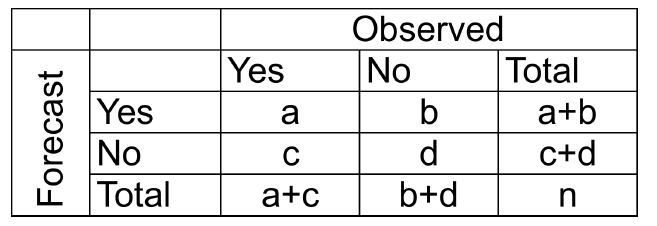
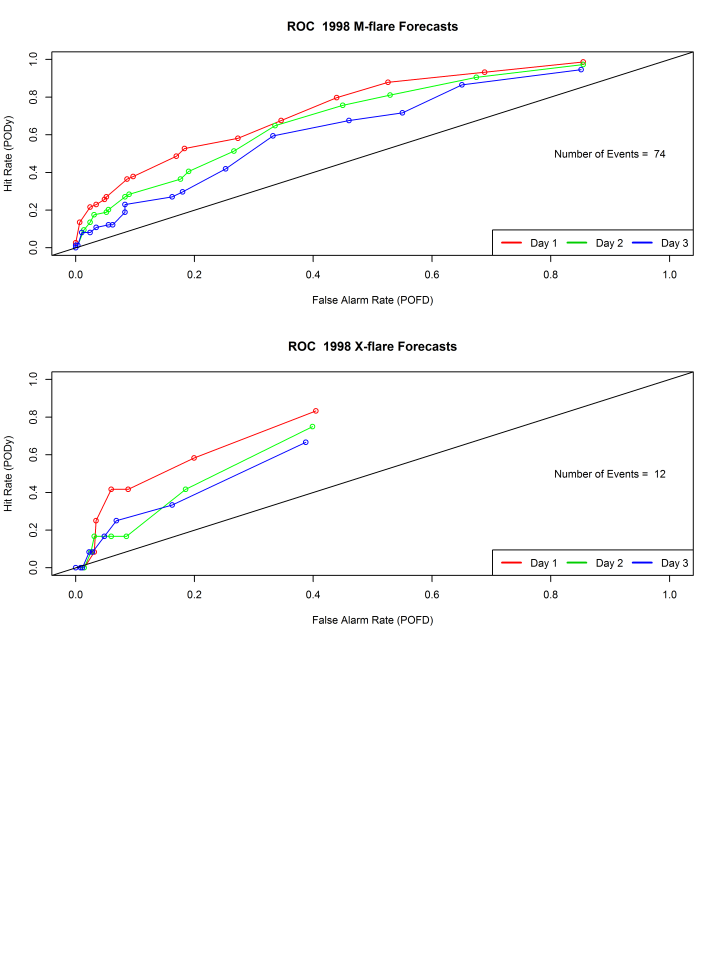
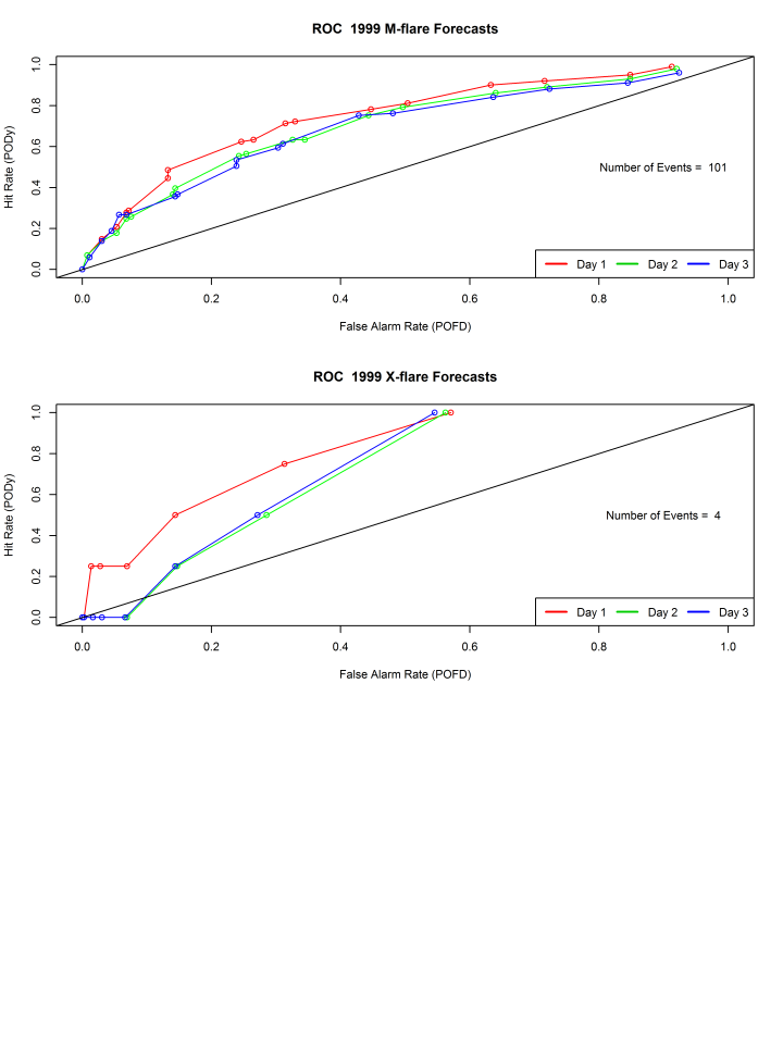
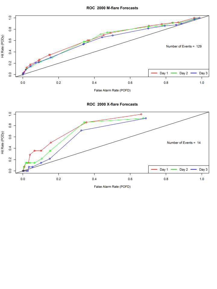
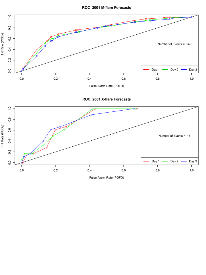
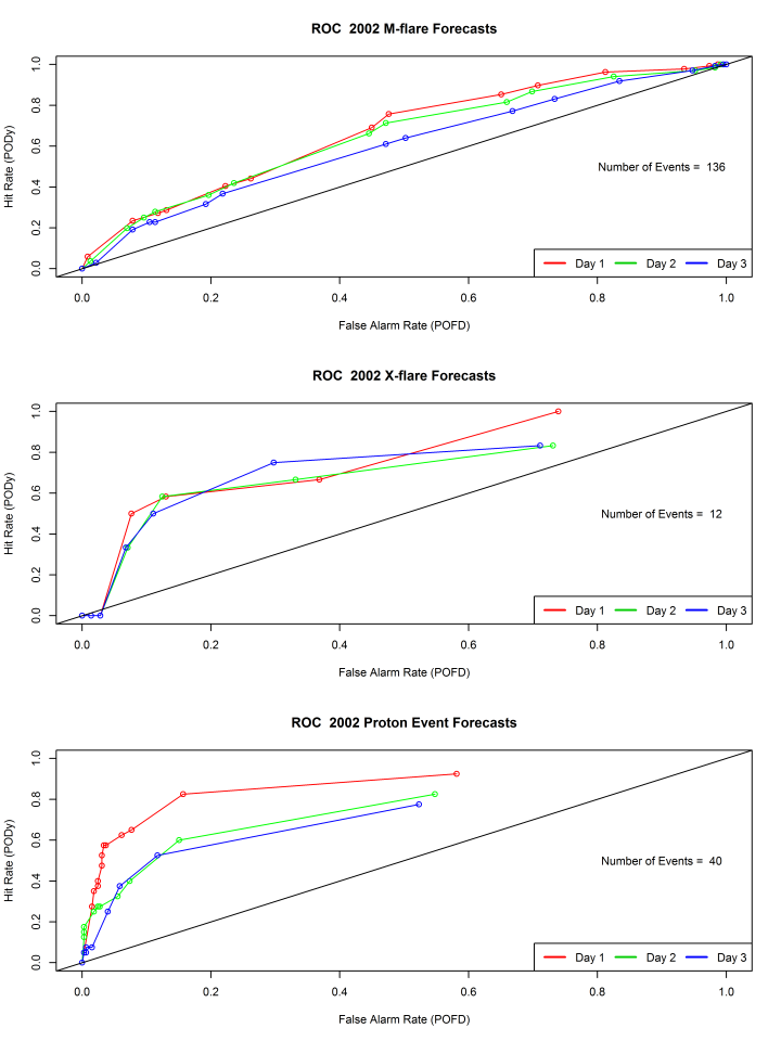
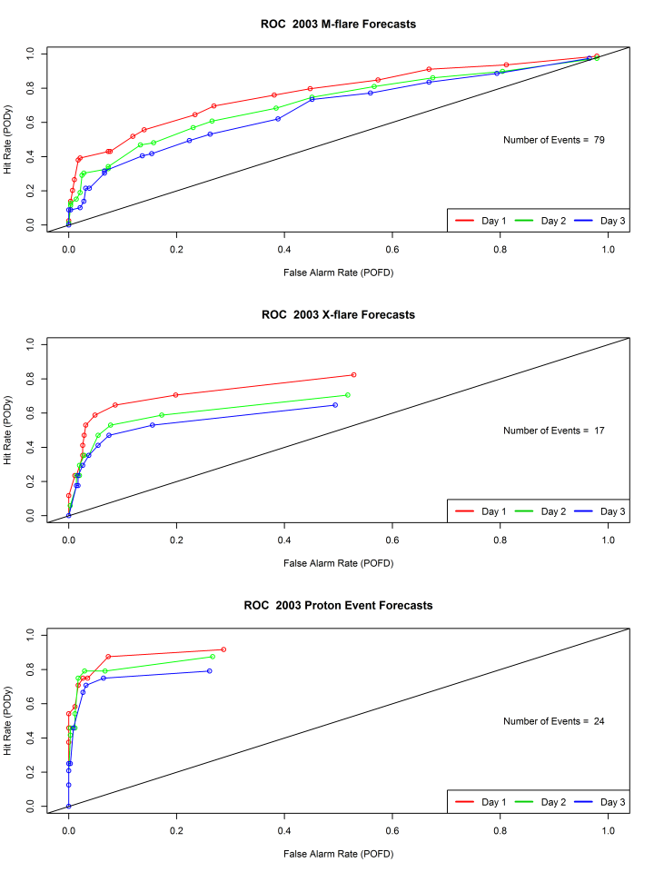
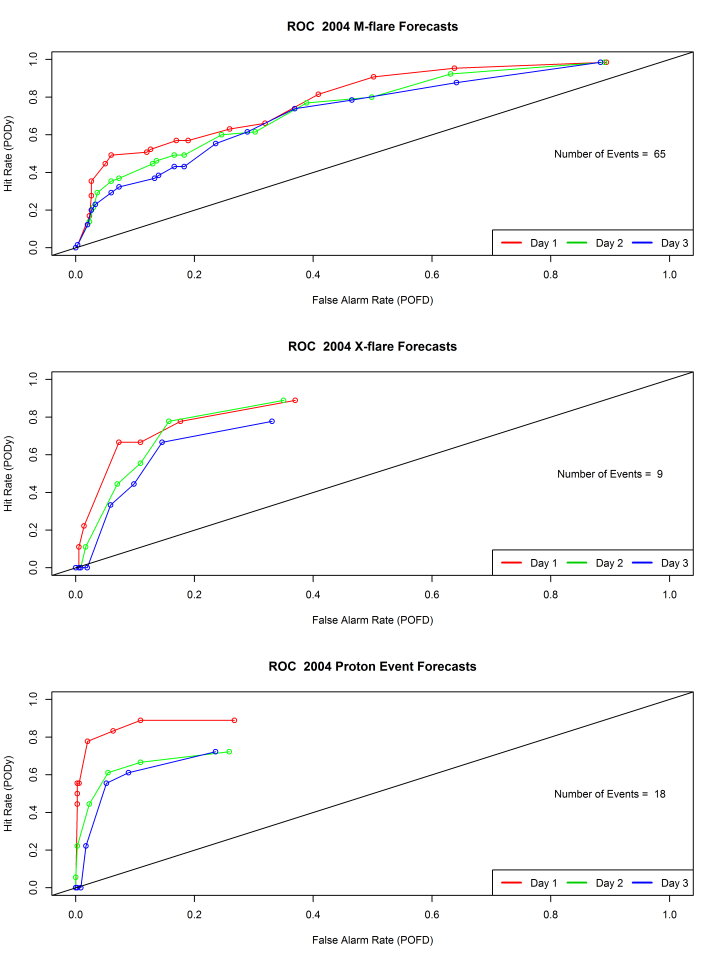
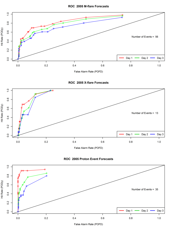
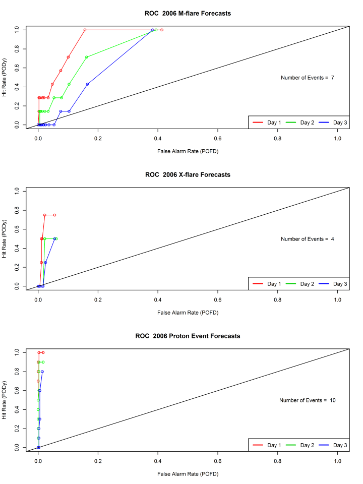
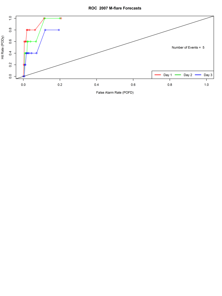
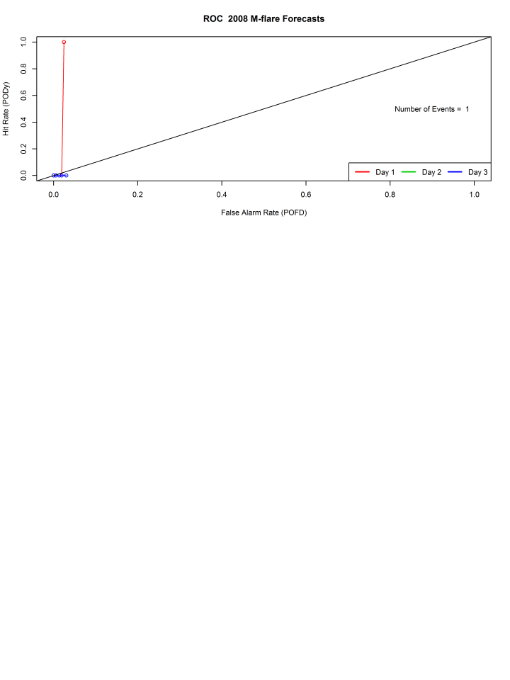
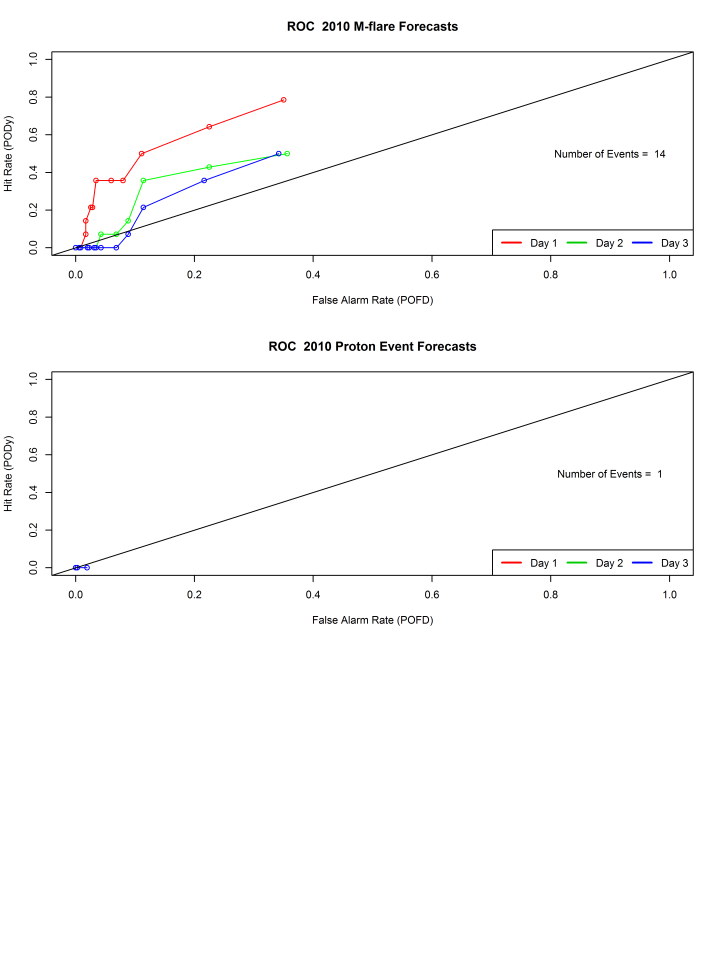
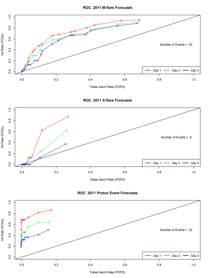
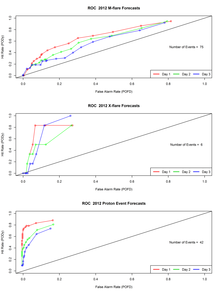
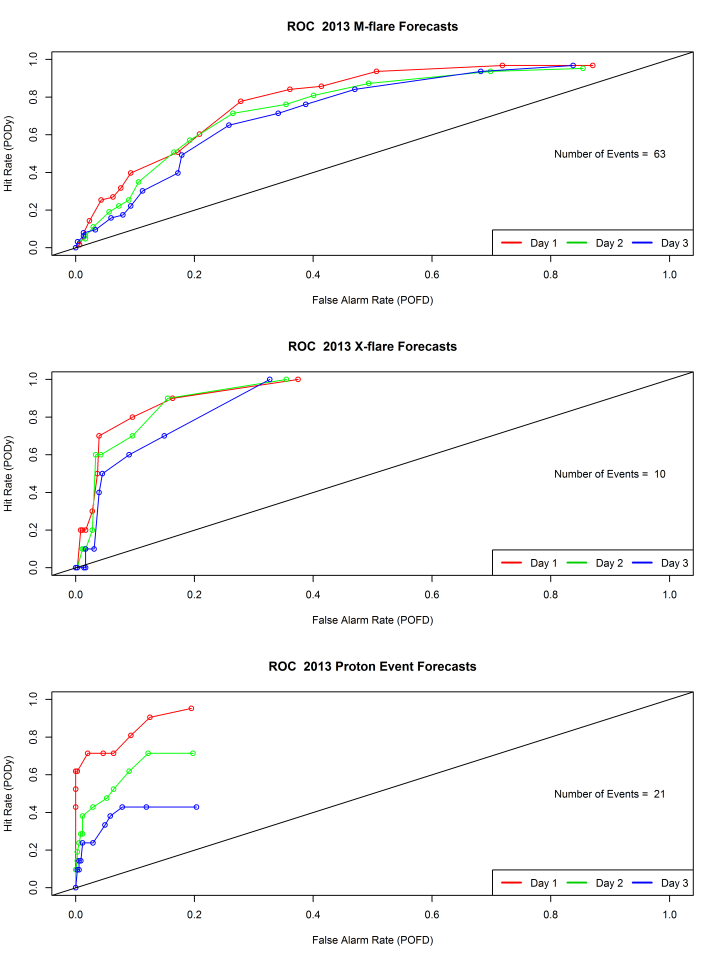
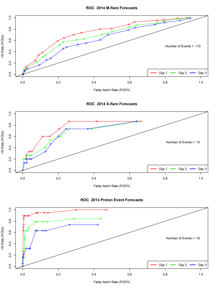
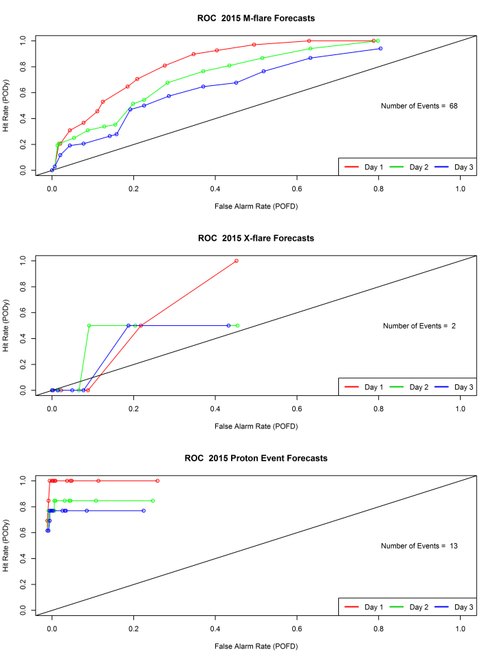
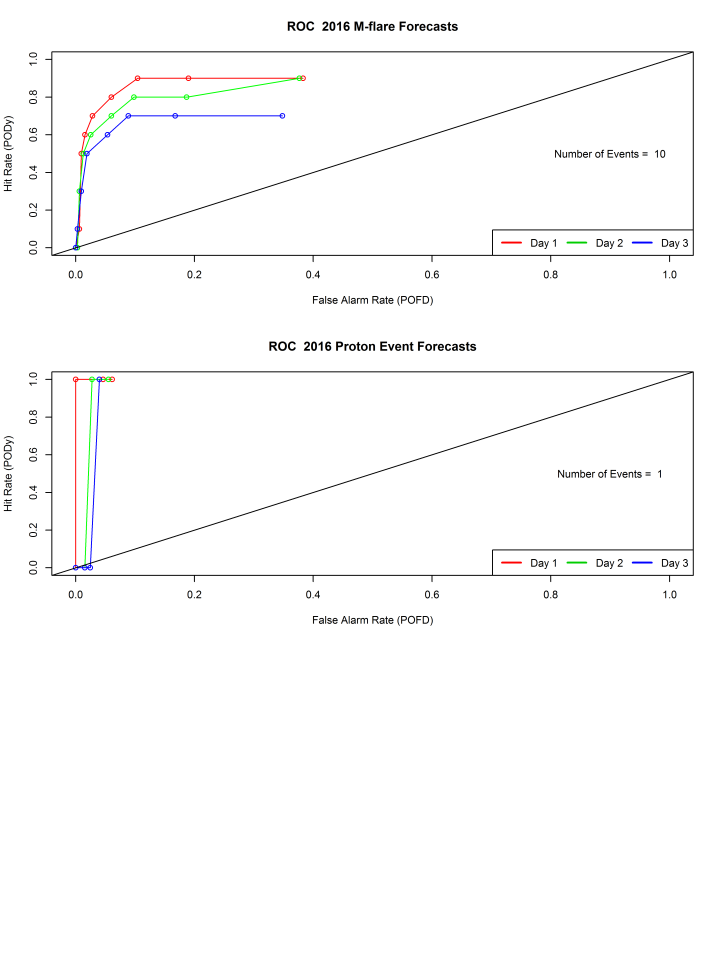
A ROC curve is a plot of the false alarm rate (also known as probability of false detection or POFD) on the x-axis, versus the hit-rate (also known as probability of detection-yes or PODy) on the y-axis.
False Alarm Rate and Hit Rate are defined as:
Hit Rate (PODy) = a/(a+c)
False Alarm Rate (POFD) = b/(b+d)
based on this contingency table:
You can read more about creating ROC curves in this presentation, slides 50-53. Finally, a thorough treatment is presented in a Weather and Forecasting article.
Here's an example:
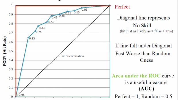
So, notice that you want your curve for whatever forecast you're making to be above the diagonal, otherwise, you have no skill. If it's under the diagonal, your forecast is worse than a random guess! The closer your curve is to the upper left corner, the better your forecast.
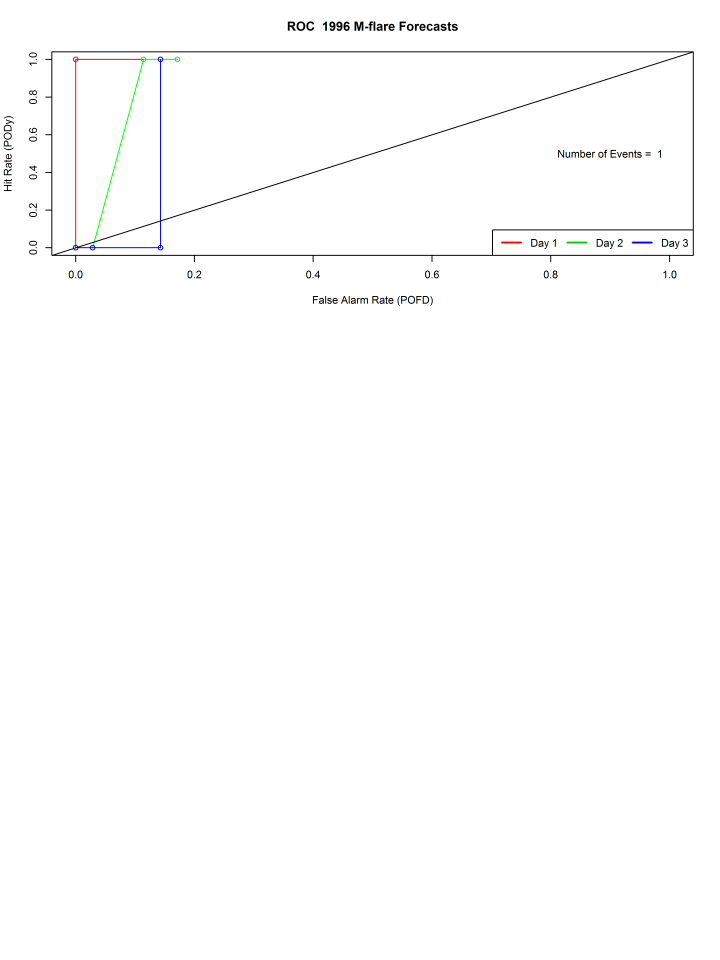
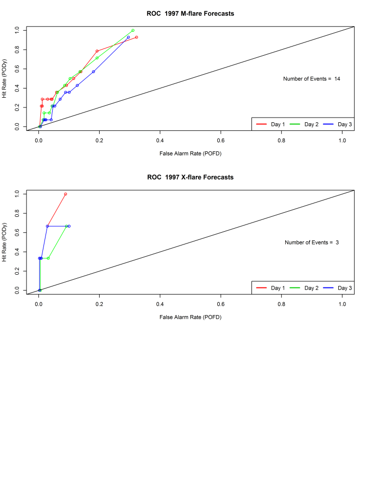
If the number of events (e.g. M-flares) is low, this interpretation will be a bit more tenuous, so the number of events with each plot are included.
The effort to develop ROC curves was spawned by conversations during the ISES Verification Workshop held a couple of years ago and they were recently highlighted in a presentation at this year's European Space Weather Workshop about a flare forecast scoreboard being established at CCMC to mirror their CME prediction scoreboard.
Notice the AUC (area under the curve) is mentioned as a potentially useful measure.
ROC (receiver operating characteristic) curves for SWPC flare forecasts (1996 to the present)
(blank plots indicate no data was available)